
The wxPython toolkit provides an alternative to using Sizers for layout that is known as “sized_controls”. These controls or widgets are basically top-level widgets (like frame, panel, dialog, etc) that have sizing logic built into them. This article will cover all four types of sized_controls. They are as follows:
- SizedPanel
- SizedScrolledPanel
- SizedFrame
- SizedDialog
The SizedScrolledPanel widget is new as of wxPython 2.9.3.1, but the other 3 types of controls are available in wxPython 2.8.8 and possibly older versions (see Trac for more info). Just keep that in mind if you are on wxPython 2.8. If you are ready, we can get started!
The SizedPanel

The SizedPanel widget will automatically create a sizer for itself. The sizer defaults to a vertical box sizer. The widget will also automatically add any children you add to the panel into the sizer. If you need to change the sizer type, just call SetSizerType() and pass it “horizontal”, “vertical”, “form” (a 2-col flex grid sizer), or “grid”. Should you choose “grid”, then you can also pass two more arguments: “cols” and “rows”. According to the wxPython demo: This class also applies control borders that adhere to the native platform’s Human Interface Guidelines (HIG) on Win, GTK and Mac.
Let’s take a look at a simple example:
# sized_panel.py

import wx
import wx.lib.sized_controls as sc

########################################################################
class SizedPanel(sc.SizedPanel):
    """"""

    #----------------------------------------------------------------------
    def __init__(self, parent):
        """Constructor"""
        sc.SizedPanel.__init__(self, parent)

        for item in range(5):
            txt = wx.TextCtrl(self)

########################################################################
class RegularFrame(wx.Frame):
    """"""

    #----------------------------------------------------------------------
    def __init__(self):
        """Constructor"""
        wx.Frame.__init__(self, None, title="SizedPanel demo",
                          size=(400,300))
        panel = SizedPanel(self)
        self.Show()

#----------------------------------------------------------------------
if __name__ == "__main__":
    app = wx.App(False)
    frame = RegularFrame()
    app.MainLoop()
The code to add widgets to sizers is much less verbose when using a sized control widget. If you want to try a little experiment, try adding the following line of code right before the loop in the SizedPanel class:
self.SetSizerType("horizontal")
This will cause the widgets to be added horizontally instead of vertically. Just for comparison’s sake, let’s take a moment and look at the regular way to do this kind of layout with a sizer:
import wx

########################################################################
class RegularPanel(wx.Panel):
    """"""

    #----------------------------------------------------------------------
    def __init__(self, parent):
        """Constructor"""
        wx.Panel.__init__(self, parent)

        sizer = wx.BoxSizer(wx.VERTICAL)
        for item in range(5):
            txt = wx.TextCtrl(self)
            sizer.Add(txt, 0, wx.ALL, 5)

        self.SetSizer(sizer)

########################################################################
class RegularFrame(wx.Frame):
    """"""

    #----------------------------------------------------------------------
    def __init__(self):
        """Constructor"""
        wx.Frame.__init__(self, None, title="SizedPanel demo",
                          size=(400,300))
        panel = RegularPanel(self)
        self.Show()

#----------------------------------------------------------------------
if __name__ == "__main__":
    app = wx.App(False)
    frame = RegularFrame()
    app.MainLoop()
The main difference between these two pieces of code is that the RegularPanel code has several extra lines related to setting up the sizer, adding widgets to the sizer and then setting the sizer.
The SizedScrolledPanel
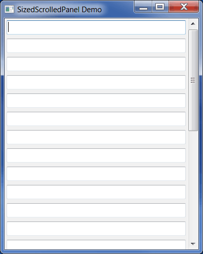
The SizedScrolledPanel is very similar to the ScrolledPanel widget in that if there are too many widgets to show on one panel, it will create a scrollbar. The main difference is that once again, the sized control will do all the sizer stuff for us. Here’s an example:
# sized_scrolled_panel.py

import wx
import wx.lib.sized_controls as sc

########################################################################
class MySizedScrolledPanel(sc.SizedScrolledPanel):
    """"""

    #----------------------------------------------------------------------
    def __init__(self, parent):
        """Constructor"""
        sc.SizedScrolledPanel.__init__(self, parent)

        for item in range(25):
            txt = wx.TextCtrl(self)
            txt.SetSizerProps(expand=True)

########################################################################
class MyFrame(wx.Frame):
    """"""

    #----------------------------------------------------------------------
    def __init__(self):
        """Constructor"""
        wx.Frame.__init__(self, None, title="SizedScrolledPanel Demo",
                          size=(400, 500))
        panel = MySizedScrolledPanel(self)
        self.Show()

#----------------------------------------------------------------------
if __name__ == "__main__":
    app = wx.App(False)
    frame = MyFrame()
    app.MainLoop()
The code above is very similar to the SizedPanel example, however I added in a little extra piece of logic to make the text controls expand. Did you see it? Take a look at the loop, right after we create the text control widget:
txt.SetSizerProps(expand=True)
By using a sized control, it adds a special method to our widgets that’s called SetSizerProps. The valid values for this method are “proportionâ€, “hgrowâ€, “vgrowâ€, “alignâ€, “halignâ€, “valignâ€, “borderâ€, “minsize†and “expandâ€. In this example, we set expand to boolean True.
The SizedFrame
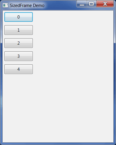
The SizedFrame is a little bit different than the last two sized controls in that it automatically sets up a SizedPanel as its first child. If you want to get access to that panel, you will need to call GetContentsPane(). Let’s look at an example:
# sized_frame.py

import wx
import wx.lib.sized_controls as sc

########################################################################
class SizedFrame(sc.SizedFrame):
    """"""

    #----------------------------------------------------------------------
    def __init__(self):
        """Constructor"""
        sc.SizedFrame.__init__(self, None, title="SizedFrame Demo",
                               size=(400,500))

        panel = self.GetContentsPane()

        for item in range(5):
            btn = wx.Button(panel, label=str(item))
            btn.SetSizerProps(border=("all", 5))

        self.Show()

#----------------------------------------------------------------------
if __name__ == "__main__":
    app = wx.App()
    frame = SizedFrame()
    app.MainLoop()
Here we see that we need to extract the SizedPanel so we can add buttons to it. That was easy!
SizedDialog
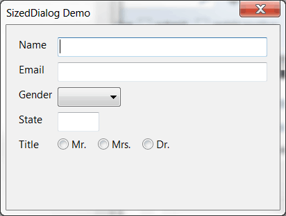
The SizedDialog is very similar to the SizedFrame in that it too has a SizedPanel built into it. Let’s make a derivative of one of the demos from the wxPython demo so we can see how it works:
# sized_dialog.py

import wx
import wx.lib.sized_controls as sc

########################################################################
class MySizedDialog(sc.SizedDialog):
    """"""

    #----------------------------------------------------------------------
    def __init__(self):
        """Constructor"""
        sc.SizedDialog.__init__(self, None, title="SizedDialog Demo",
                                size=(400,500))

        panel = self.GetContentsPane()
        panel.SetSizerType("form")

        # row 1
        wx.StaticText(panel, -1, "Name")
        textCtrl = wx.TextCtrl(panel)
        textCtrl.SetSizerProps(expand=True)

        # row 2
        wx.StaticText(panel, -1, "Email")
        emailCtrl = wx.TextCtrl(panel)
        emailCtrl.SetSizerProps(expand=True)

        # row 3
        wx.StaticText(panel, -1, "Gender")
        wx.Choice(panel, -1, choices=["male", "female"])

        # row 4
        wx.StaticText(panel, -1, "State")
        wx.TextCtrl(panel, size=(60, -1)) # two chars for state

        # row 5
        wx.StaticText(panel, -1, "Title")

        # here's how to add a 'nested sizer' using sized_controls
        radioPane = sc.SizedPanel(panel, -1)
        radioPane.SetSizerType("horizontal")

        # make these children of the radioPane to have them use
        # the horizontal layout
        wx.RadioButton(radioPane, -1, "Mr.")
        wx.RadioButton(radioPane, -1, "Mrs.")
        wx.RadioButton(radioPane, -1, "Dr.")
        # end row 5

#----------------------------------------------------------------------
if __name__ == "__main__":
    app = wx.App(False)
    dlg = MySizedDialog()
    dlg.ShowModal()
    app.MainLoop()
This code demonstrates two new concepts. It shows a new sizer type (“form”) and it shows how to nest a sizer. The sizer type “form” basically tells wxPython to put the widgets into two columns instead of stacking them all vertically. Thus we have a StaticText and a TextCtrl on the same level with each other. The RadioButtons are all on their own row. How did that happen? This is where the nested sizer piece comes in. We create a new SizedPanel that we assign to radioPane and then we change its orientation to “horizontal”. Next we add the 3 RadioButtons to it by setting radioPane as their parent.
Wrapping Up
At this point you should have enough information to get started using wxPython’s sized controls for yourself. You have just learned how to use all four variants: SizedPanel, SizedScrolledPanel, SizedFrame and SizedDialog. You have also learned a little about how to nest sized controls in each other. Nesting is a very powerful tool that can help you create very complex interfaces. I think the best thing about sized controls is that they make using sizers more intuitive.
Additional Resouces
- wxPython documentation on sized controls
- wxPython wiki entry on sized controls
Download the Source
Note: The code in this article was tested using wxPython 2.9.4.0 (classic) and Python 2.7.3 on Windows 7
It looks like I somehow missed a line in the example. I re-added the following: “panel.SetSizerType(“form”)”. Sorry about that. As for the docs link, the Phoenix docs are the newest and tend to be more complete than the older versions. They are also easier to follow.
Thanks for the fix. You wrote this was tested with 2.9.4.0, not Phoenix. Phoenix has numerous API changes, can’t use it until I migrate my code. All the docs I’ve found on sized controls are incomplete. I’ve had a lot of trouble getting them to work, maybe because I don’t have enough experience using sizers. But they do make the code cleaner. Thanks for getting folks started with them.
Yes, you’re right. I don’t think there is such a thing as 2.9 docs though. The closest I can find is Andrea’s docs: http://xoomer.virgilio.it/infinity77/Phoenix/lib.sized_controls.html#module-lib.sized_controls (they’re for 2.9 Phoenix).
Here are the 2.8 docs though: http://www.wxpython.org/docs/api/wx.lib.sized_controls-module.html