Reportlab is really nice tool for creating PDFs in Python. A little known fact is that they now support adding charts or graphs to your PDF. Previously if you wanted that functionality, you would have to do all the drawing code yourself. Unfortunately, the Reportlab guide doesn’t really explain how to use their charts, what kinds of charts are supported or what their parameters / attributes / etc are. They do have some example code snippets on their website though. In this article, we’ll go over a couple of simple examples to show you how to use Reportlab’s charting capabilities.
Creating a bar graph

A common need is the ability to create a bar chart. The examples that Reportlab provides are pretty cool, but extremely verbose. Let’s look at a simple example instead:
from reportlab.lib.colors import PCMYKColor
from reportlab.graphics.shapes import Drawing
from reportlab.graphics.charts.barcharts import VerticalBarChart

#----------------------------------------------------------------------
def create_bar_graph():
    """
    Creates a bar graph in a PDF
    """
    d = Drawing(280, 250)
    bar = VerticalBarChart()
    bar.x = 50
    bar.y = 85
    data = [[1,2,3,None,None,None,5],
            [10,5,2,6,8,3,5],
            [5,7,2,8,8,2,5],
            [2,10,2,1,8,9,5],
            ]
    bar.data = data
    bar.categoryAxis.categoryNames = ['Year1', 'Year2', 'Year3',
                                      'Year4', 'Year5', 'Year6',
                                      'Year7']

    bar.bars[0].fillColor   = PCMYKColor(0,100,100,40,alpha=85)
    bar.bars[1].fillColor   = PCMYKColor(23,51,0,4,alpha=85)
    bar.bars.fillColor       = PCMYKColor(100,0,90,50,alpha=85)

    d.add(bar, '')

    d.save(formats=['pdf'], outDir='.', fnRoot='test')

if __name__ == '__main__':
    create_bar_graph()
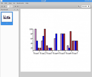
Here we import a few items that we need from the Reportlab package. The ones we care about most are Drawing and VerticalBarChart. The Drawing class allows us to basically create a canvas to draw on. When we create it, we have to specify how big the so-called canvas is. Then we create an instance of VerticalBarChart and tell it what position to be in via x/y coordinates. Next we add some data to the graph and some category names, which are the names that go on the x-axis. Finally we set some colors for the various bars in our bar graph by using Reportlab’s PCMYKColor class and add the chart to the drawing.
At the very end, we save the bar graph to disk. The format is a bit weird, but according to the source code, you can tell it to save the chart in multiple formats (pdf, eps, svg, ps, and various image formats). You also need to tell it which directory to save the file(s) to and optionally what the name should be via fnRoot. There are many, many other properties that you can set and tweak when creating a bar chart, but we won’t be covering them here. Check out some of the previously mentioned Reportlab samples for examples.
If you run the code above, you should see a PDF that has contents similar to the screenshot at the beginning of this section. Now let’s move on and learn how to create a pie chart!
Creating a pie chart

Creating a pie chart with Reportlab is a little bit easier. Let’s take a look!
from reportlab.graphics.shapes import Drawing
from reportlab.graphics.charts.piecharts import Pie

#----------------------------------------------------------------------
def create_pie_chart():
    """"""
    d = Drawing()
    pie = Pie()
    pie.x = 200
    pie.y = 65
    pie_data = [10, 20, 30, 40]
    pie.labels = [letter for letter in 'abcd']
    pie.slices.strokeWidth = 0.5
    pie.slices[3].popout = 20
    d.add(pie)
    d.save(formats=['pdf'], outDir='.', fnRoot='test-pie')


if __name__ == '__main__':
    create_pie_chart()
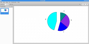
Here we only import two items from Reportlab, namely the aforementioned Drawing class and the Pie chart class. As before, we create an instance of the Drawing class and this time, the Pie class. Once again, we also position the Pie chart by setting its x/y coordinates. The data is a little more interesting in that it has to has to add up to 100 as pie charts represent percentages, so make sure that your values add up appropriately. Next we add some labels and tell it what the width of the lines should be. For fun, we tell it to pop out the 4th element (note: it’s zero-based) from the pie. Finally we add the chart to the drawing and save it.
Adding a Legend

Legends are pretty common in charts. Fortunately Reportlab provided a fairly simple way to add a legend. Let’s modify our pie chart code and add a legend to it!
from reportlab.graphics.charts.legends import Legend
from reportlab.graphics.charts.piecharts import Pie
from reportlab.graphics.shapes import Drawing
from reportlab.lib.validators import Auto

#----------------------------------------------------------------------
def add_legend(draw_obj, chart, data):
    """"""
    legend = Legend()
    legend.alignment = 'right'
    legend.x = 10
    legend.y = 70
    legend.colorNamePairs = Auto(obj=chart)
    draw_obj.add(legend)

#----------------------------------------------------------------------
def create_pie_chart(legend=False):
    """"""
    data = [10, 20, 30, 40]
    d = Drawing()
    pie = Pie()
    # required by Auto
    pie._seriesCount = 4

    if legend:
        add_legend(d, pie, data)

    pie.x = 150
    pie.y = 65
    pie_data = data
    pie.labels = [letter for letter in 'abcd']
    pie.slices.strokeWidth = 0.5
    pie.slices[3].popout = 20
    d.add(pie)
    d.save(formats=['pdf'], outDir='.', fnRoot='test-pie')


if __name__ == '__main__':
    create_pie_chart(True)
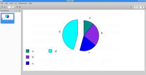
This time around, we import a Legend class and an Auto class. We also create an add_legend function to make adding a legend a bit easier and to encapsulate that code to make it easier to update. In that function, we set the legend’s alignment and position. Then we use some Reportlab magic with its Auto validator to map the correct colors in the legend to the bar chart bars. Finally we add the legend to the drawing and save the PDF to disk.
Wrapping Up
There are many other types of charts and sub-charts in Reportlab. This article barely scratched the surface when it comes to what Reportlab can do with charts. For example, you can specify bar spacing and width, fonts, all kinds of axis settings for both x and y, labels for x and y and much more. You should definitely check out Reportlab’s official samples to get an idea of what you can do with their package. You’ll also probably have to take a dive into the source code to figure out how some of the pieces fit together and what the various arguments mean. It’s a very powerful package, but the documentation is kind of rough.

after we build PDF by reportlab how can print the document directly by python?
are you have any standard method ?
Pingback: ReportLab: Adding a Chart to a PDF with Python | The Mouse Vs. The Python
Pingback: Mike Driscoll: ReportLab: Adding a Chart to a PDF with Python – Cebu Scripts
Pingback: Adding SVGs to PDFs with Python and ReportLab - The Mouse Vs. The Python