
The ReportLab toolkit supports adding many different charts and graphs to your PDFs. In fact, I have covered some of them in a previous article. However most of the examples I have seen, including the ones in my own article, do not show how to insert a chart as a Flowable.
What that means is that most examples show you how to create a PDF with a single page that contains the chart in it. Most developers would want to be able to create some text, perhaps a table and insert the chart along with those elements. You would also usually have additional text following the chart.
For this article, you will learn how to do just that.
Adding a Chart
Let’s create a simple Pie Chart and add it a simple PDF. This PDF that you will be creating will have a sentence before and after the chart.
Here’s the code:
from reportlab.lib.styles import getSampleStyleSheet
from reportlab.lib.validators import Auto
from reportlab.graphics.charts.legends import Legend
from reportlab.graphics.charts.piecharts import Pie
from reportlab.graphics.shapes import Drawing, String
from reportlab.platypus import SimpleDocTemplate, Paragraph

def add_legend(draw_obj, chart, data):
    legend = Legend()
    legend.alignment = 'right'
    legend.x = 10
    legend.y = 70
    legend.colorNamePairs = Auto(obj=chart)
    draw_obj.add(legend)

def pie_chart_with_legend():
    data = list(range(15, 105, 15))
    drawing = Drawing(width=400, height=200)
    my_title = String(170, 40, 'My Pie Chart', fontSize=14)
    pie = Pie()
    pie.sideLabels = True
    pie.x = 150
    pie.y = 65
    pie.data = data
    pie.labels = [letter for letter in 'abcdefg']
    pie.slices.strokeWidth = 0.5
    drawing.add(my_title)
    drawing.add(pie)
    add_legend(drawing, pie, data)
    return drawing

def main():
    doc = SimpleDocTemplate('flowable_with_chart.pdf')

    elements = []
    styles = getSampleStyleSheet()
    ptext = Paragraph('Text before the chart', styles["Normal"])
    elements.append(ptext)

    chart = pie_chart_with_legend()
    elements.append(chart)

    ptext = Paragraph('Text after the chart', styles["Normal"])
    elements.append(ptext)
    doc.build(elements)

if __name__ == '__main__':
    main()
There are a lot of imports that are required. Feel free to look those up in ReportLab’s documentation. I will be focusing on the functions here instead. The first function will create a Legend for the chart. It sets the x/y coordinates for the chart and uses the chart object to determine the colors in the legend automatically.
The second function will create the Pie Chart itself. Charts in ReportLab are put inside of Drawing objects. Thus, you create a Drawing object, then a Pie object. Next you set its position and add some data to the chart. You also add labels and set the stroke width for the chart before adding it to the drawing.
The last function is called main(). Here you will create a document template and add a string of text using ReportLab’s Paragraph object. Then you call the Pie Chart creation function to get the drawing which can be added to the list of Flowables that you are calling elements. Finally you add another Paragraph and then build the document and write it to disk.
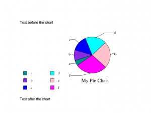
This is what the contents of the PDF should look like:
Wrapping Up
This is a fairly short article, but I hope it helps you see how you can insert charts into your PDFs using Python and ReportLab. If you are interested in adding other types of charts, you should check out ReportLab’s documentation or see one of the articles below.
Related Reading
- Reportlab – How to Add Charts / Graphs
- A Simple Step-by-Step Reportlab Tutorial
Pingback: Links 9/4/2019: CRI-O/CNCF and Lutris 0.5.2 Released | Techrights
Pingback: Rotating Images in ReportLab - The Mouse Vs. The Python
Pingback: Getting Started with ReportLab's Canvas - Mouse Vs Python