Some people learn through doing it, others are better with visual stimuli. At least, that’s what we’re told. So in the spirit of what we’ve been taught, we’re going to take a look at the visual half of the equation and see how we can make graphs with wxPython. You may not know this, but wxPython includes a widget just for this purpose. It’s name is PyPlot. PyPlot is great at doing simple plots and it’s super fast too! If you need to weird or complicated plotting, then you’ll want to use matplotlib instead. Fortunately, wxPython and matplotlib play well with each other, but we won’t be looking at matplotlib in this article.
Getting Started (with a Bar Graph!)
If you look at the plot.py file in the wxPython distribution you’ll discover that PyPlot requires Numeric, numarray or numpy (in reverse order) so make sure you have one of those installed to be able to use this widget. Of course, wxPython is also required, but you knew that, right?
Anyway, at the bottom of that Python file, there’s a simple demo that shows how to do various graphs with PyPlot. Let’s take some of that code and see if we can figure it out.
import wx
from wx.lib.plot import PolyLine, PlotCanvas, PlotGraphics

#----------------------------------------------------------------------
def drawBarGraph():
    # Bar graph
    points1=[(1,0), (1,10)]
    line1 = PolyLine(points1, colour='green', legend='Feb.', width=10)
    points1g=[(2,0), (2,4)]
    line1g = PolyLine(points1g, colour='red', legend='Mar.', width=10)
    points1b=[(3,0), (3,6)]
    line1b = PolyLine(points1b, colour='blue', legend='Apr.', width=10)

    points2=[(4,0), (4,12)]
    line2 = PolyLine(points2, colour='Yellow', legend='May', width=10)
    points2g=[(5,0), (5,8)]
    line2g = PolyLine(points2g, colour='orange', legend='June', width=10)
    points2b=[(6,0), (6,4)]
    line2b = PolyLine(points2b, colour='brown', legend='July', width=10)

    return PlotGraphics([line1, line1g, line1b, line2, line2g, line2b],
                        "Bar Graph - (Turn on Grid, Legend)", "Months",
                        "Number of Students")

########################################################################
class MyGraph(wx.Frame):

    #----------------------------------------------------------------------
    def __init__(self):
        wx.Frame.__init__(self, None, wx.ID_ANY,
                          'My First Plot (to take over the world!)')

        # Add a panel so it looks the correct on all platforms
        panel = wx.Panel(self, wx.ID_ANY)

        # create some sizers
        mainSizer = wx.BoxSizer(wx.VERTICAL)
        checkSizer = wx.BoxSizer(wx.HORIZONTAL)

        # create the widgets
        self.canvas = PlotCanvas(panel)
        self.canvas.Draw(drawBarGraph())
        toggleGrid = wx.CheckBox(panel, label="Show Grid")
        toggleGrid.Bind(wx.EVT_CHECKBOX, self.onToggleGrid)
        toggleLegend = wx.CheckBox(panel, label="Show Legend")
        toggleLegend.Bind(wx.EVT_CHECKBOX, self.onToggleLegend)

        # layout the widgets
        mainSizer.Add(self.canvas, 1, wx.EXPAND)
        checkSizer.Add(toggleGrid, 0, wx.ALL, 5)
        checkSizer.Add(toggleLegend, 0, wx.ALL, 5)
        mainSizer.Add(checkSizer)
        panel.SetSizer(mainSizer)

    #----------------------------------------------------------------------
    def onToggleGrid(self, event):
        """"""
        self.canvas.SetEnableGrid(event.IsChecked())

    #----------------------------------------------------------------------
    def onToggleLegend(self, event):
        """"""
        self.canvas.SetEnableLegend(event.IsChecked())

if __name__ == '__main__':
    app = wx.App(False)
    frame = MyGraph()
    frame.Show()
    app.MainLoop()
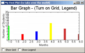
The drawBarGraph function is pulled directly from the plot.py file that was mentioned earlier. For this example, the function name was changed from “_draw6Objects” to “drawBarGraph” to make the code easier to follow. Let’s take a look at it. The points are the points on the graph: [(x1, y1), (x2, y2)]. They tell PyPlot where to plot via the PolyLine method. As you can see, PolyLine takes a list of tuples of graph points, and optionally, a colour, legend, width and style (not shown). We create a series of PolyLines and then add them to a PlotGraphics instance. The PlotGraphics first method is a list of PolyLines (or other PolyXXX objects), title, xLabel and yLabel. We return the PlotGraphics object back to the caller which is in our wxPython class.
Now we turn our attention to that class, which has the bland name of MyGraph. The first few lines are pretty familiar if you’ve used wxPython before, so let’s skip those and jump right down to the widget creation section. Here we see how to create a PlotCanvas with just a plain wx.Panel as its parent. To draw the bar graph, we call our canvas object’s Draw method, passing in the PlotGraphics object that was returned from the drawBarGraph function. Feel free to re-read that as many times as needed to understand what’s going on before continuing.
Are you ready? Then let’s continue! After we draw the bar graph, we create a couple check boxes to allow us to toggle the graph’s grid and legend. Then we lay out the widgets on the frame. The check box’s methods are pretty self-explanatory, so you can figure those out on your own. Hint: IsChecked() returns a Boolean.
Graphing Using Saved Data
Normally you’ll want to read the data from a saved file, database or a web service rather than using hard-coded data. Here we’ll look at using some saved data to create a graph. Here’s the data we’ll be using (you’ll probably want to download the archives at the bottom of the article):
# http://www.wunderground.com/history/airport/KMIW/2010/9/22/WeeklyHistory.html?format=1

CDT,Max TemperatureF,Mean TemperatureF,Min TemperatureF,Max Dew PointF,MeanDew PointF,Min DewpointF,Max Humidity, Mean Humidity, Min Humidity, Max Sea Level PressureIn, Mean Sea Level PressureIn, Min Sea Level PressureIn, Max VisibilityMiles, Mean VisibilityMiles, Min VisibilityMiles, Max Wind SpeedMPH, Mean Wind SpeedMPH, Max Gust SpeedMPH,PrecipitationIn, CloudCover, Events

2010-9-19,56,52,47,55,49,44,100,97,93,30.21,30.17,30.11,10,5,2,14,9,20,0.34,8,Rain-Thunderstorm

2010-9-20,88,72,56,71,62,55,100,73,46,30.10,29.94,29.77,10,6,0,25,12,32,T,4,Fog-Rain

2010-9-21,75,70,64,66,64,63,93,83,73,29.89,29.83,29.75,10,7,0,22,7,30,1.79,5,Fog-Rain-Thunderstorm

2010-9-22,75,70,64,68,64,63,100,93,69,30.00,29.96,29.86,10,5,1,15,4,,0.26,8,Rain
The first line is the website, the second tells us what the comma delimited lines that follow are. The last four lines are plain data with some junk HTML at the end of each ling. The last line is also something we’ll want to ignore. Let’s create some code to actually plot this data!
import wx
from wx.lib.plot import PolyLine, PlotCanvas, PlotGraphics

class MyGraph(wx.Frame):

    def __init__(self):
        wx.Frame.__init__(self, None, wx.ID_ANY,
                          'Plotting File Data')

        # Add a panel so it looks the correct on all platforms
        panel = wx.Panel(self, wx.ID_ANY)
        self.canvas = PlotCanvas(panel)
        self.canvas.Draw(self.createPlotGraphics())

        sizer = wx.BoxSizer(wx.VERTICAL)
        sizer.Add(self.canvas, 1, wx.EXPAND)
        panel.SetSizer(sizer)

    #----------------------------------------------------------------------
    def readFile(self):
        """"""
        # normally you would want to pass a file path in, NOT hard code it!
        f = open("data.txt")
        # skip the first two lines of text in the file
        data = f.readlines()[2:-1]
        temps = []
        for line in data:
            parts = line.split(",")
            date = parts[0].split("-")
            day = date[2]
            points = [(day, parts[3]), (day, parts[1])]
            temps.append(points)
        return temps

    #----------------------------------------------------------------------
    def createPlotGraphics(self):
        """"""
        temps = self.readFile()
        lines = []
        for temp in temps:
            tempInt = int(temp[1][1])
            if tempInt < 60:
                color = "blue"
            elif tempInt >=60 and tempInt <= 75:
                color = "orange"
            else:
                color = "red"
            lines.append(PolyLine(temp, colour=color, width=10))

        return PlotGraphics(lines, "Bar Graph of Temperatures",
                            "Days", "Temperatures")

if __name__ == '__main__':
    app = wx.App(False)
    frame = MyGraph()
    frame.Show()
    app.MainLoop()
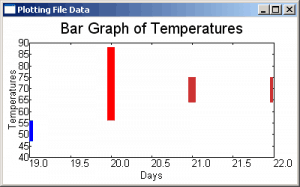
Can you figure this code out? Well, if you can't (or don't want to) then you can read all about it now! Just like in our previous example, we import a few things and create a wx.Frame with a panel and a PlotCanvas. We have a simple readFile method and a createPlotGraphics method too. These two methods are what we will focus on.
The readFile method is called by the createPlotGraphics method. All it does is read a file. For this example, we have the "path" to the file hard-coded. What you would normally want to do is use some kind of file browser to load the file, but we're going the super-simple route. When we read the lines from the file, we skip over the first two by using the following syntax:
data = f.readlines()[2:-1]
What that does is skip the first two lines in the file and read to the end, minus one line. By doing it this way, we skip the junk at the beginning and the end. Isn't Python cool? Next we create a simple "for loop" to pull out the data we want, which is just the day, the low and the high temperatures. The rest we just throw away.
In the createPlotGraphics method, we take the list of temps returned from the readFile method and loop over those, creating a new list of PolyLines. We use the some "if statements" to decide what color to make each bar in the bar graph. Finally, we put all the PolyLines into a PlotGraphics instance and return that to the called in the __init__ method. That's all there is to it!
Point Plot with Thousands of Points
Now we're going to look at how to create a point plot with 25,000 plots! This one is also from the demo. Here's the code:
import numpy.oldnumeric as _Numeric
import wx
from wx.lib.plot import PlotCanvas, PlotGraphics, PolyLine, PolyMarker

#----------------------------------------------------------------------
def drawLinePlot():
    # 25,000 point line
    data1 = _Numeric.arange(5e5,1e6,10)
    data1.shape = (25000, 2)
    line1 = PolyLine(data1, legend='Wide Line', colour='green', width=5)

    # A few more points...
    markers2 = PolyMarker(data1, legend='Square', colour='blue',
                          marker='square')
    return PlotGraphics([line1, markers2], "25,000 Points", "Value X", "")


########################################################################
class MyGraph(wx.Frame):

    #----------------------------------------------------------------------
    def __init__(self):
        wx.Frame.__init__(self, None, wx.ID_ANY,
                          'It Looks Like a Line Graph!')

        # Add a panel so it looks the correct on all platforms
        panel = wx.Panel(self, wx.ID_ANY)

        # create some sizers
        mainSizer = wx.BoxSizer(wx.VERTICAL)
        checkSizer = wx.BoxSizer(wx.HORIZONTAL)

        # create the widgets
        self.canvas = PlotCanvas(panel)
        self.canvas.Draw(drawLinePlot())
        toggleGrid = wx.CheckBox(panel, label="Show Grid")
        toggleGrid.Bind(wx.EVT_CHECKBOX, self.onToggleGrid)
        toggleLegend = wx.CheckBox(panel, label="Show Legend")
        toggleLegend.Bind(wx.EVT_CHECKBOX, self.onToggleLegend)

        # layout the widgets
        mainSizer.Add(self.canvas, 1, wx.EXPAND)
        checkSizer.Add(toggleGrid, 0, wx.ALL, 5)
        checkSizer.Add(toggleLegend, 0, wx.ALL, 5)
        mainSizer.Add(checkSizer)
        panel.SetSizer(mainSizer)

    #----------------------------------------------------------------------
    def onToggleGrid(self, event):
        """"""
        self.canvas.SetEnableGrid(event.IsChecked())

    #----------------------------------------------------------------------
    def onToggleLegend(self, event):
        """"""
        self.canvas.SetEnableLegend(event.IsChecked())

if __name__ == '__main__':
    app = wx.App(False)
    frame = MyGraph()
    frame.Show()
    app.MainLoop()
We reuse most of the wxPython code that we saw in our original example and just call a different function here. The drawLinePlot function is pretty simple. For this example, we use numpy to create the 25,000 plot points and then create a PolyLine with them. If you zoom in, you will see that some of the points are square instead of round. That's what the PolyMarker class is for. It sets the style of the "marker". Now we're ready to look at our next example!
Creating a Sine / Cosine Graph
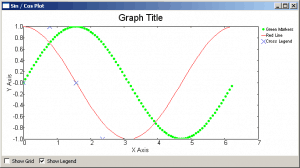
This example shows you how to take a Sine and a Cosine and graph them. It kind of looks like a horizontal double-helix. Anyway, here's the code:
import numpy.oldnumeric as _Numeric
import wx
from wx.lib.plot import PlotCanvas, PlotGraphics, PolyLine, PolyMarker

def drawSinCosWaves():
    # 100 points sin function, plotted as green circles
    data1 = 2.*_Numeric.pi*_Numeric.arange(200)/200.
    data1.shape = (100, 2)
    data1[:,1] = _Numeric.sin(data1[:,0])
    markers1 = PolyMarker(data1, legend='Green Markers', colour='green', marker='circle',size=1)

    # 50 points cos function, plotted as red line
    data1 = 2.*_Numeric.pi*_Numeric.arange(100)/100.
    data1.shape = (50,2)
    data1[:,1] = _Numeric.cos(data1[:,0])
    lines = PolyLine(data1, legend= 'Red Line', colour='red')

    # A few more points...
    pi = _Numeric.pi
    markers2 = PolyMarker([(0., 0.), (pi/4., 1.), (pi/2, 0.),
                          (3.*pi/4., -1)], legend='Cross Legend', colour='blue',
                          marker='cross')

    return PlotGraphics([markers1, lines, markers2],"Graph Title", "X Axis", "Y Axis")

########################################################################
class MyGraph(wx.Frame):

    #----------------------------------------------------------------------
    def __init__(self):
        wx.Frame.__init__(self, None, wx.ID_ANY,
                          'Sin / Cos Plot')

        # Add a panel so it looks the correct on all platforms
        panel = wx.Panel(self, wx.ID_ANY)

        # create some sizers
        mainSizer = wx.BoxSizer(wx.VERTICAL)
        checkSizer = wx.BoxSizer(wx.HORIZONTAL)

        # create the widgets
        self.canvas = PlotCanvas(panel)
        self.canvas.Draw(drawSinCosWaves())
        toggleGrid = wx.CheckBox(panel, label="Show Grid")
        toggleGrid.Bind(wx.EVT_CHECKBOX, self.onToggleGrid)
        toggleLegend = wx.CheckBox(panel, label="Show Legend")
        toggleLegend.Bind(wx.EVT_CHECKBOX, self.onToggleLegend)

        # layout the widgets
        mainSizer.Add(self.canvas, 1, wx.EXPAND)
        checkSizer.Add(toggleGrid, 0, wx.ALL, 5)
        checkSizer.Add(toggleLegend, 0, wx.ALL, 5)
        mainSizer.Add(checkSizer)
        panel.SetSizer(mainSizer)

    #----------------------------------------------------------------------
    def onToggleGrid(self, event):
        """"""
        self.canvas.SetEnableGrid(event.IsChecked())

    #----------------------------------------------------------------------
    def onToggleLegend(self, event):
        """"""
        self.canvas.SetEnableLegend(event.IsChecked())

if __name__ == '__main__':
    app = wx.App(False)
    frame = MyGraph()
    frame.Show()
    app.MainLoop()
This example is for the math geeks out there. I haven't done trigonometry or geometry in quite a while, so I won't explain the equations here. You can look up that sort of thing with your favorite search engine. This example uses one PolyLine and two PolyMarkers to create the graph. It's mostly like the other examples though, so there's really not much to say.
Wrapping Up
By now you should be more than ready to undertake doing graphs on your own with wxPython. If you get stuck, there are several other examples in the plot.py file and the wxPython mailing list members are quite friendly and will probably help you if you ask nicely. Let me know if you create anything cool!
Note: The code in this article was tested on Windows XP, Python 2.5, wxPython 2.8.10.1
Further Reading
- Official documentation for PyPlot


