In the last article, we covered a wide variety of buttons that come with the standard wxPython package. Now we’re going to look at a whole bunch more! In case you haven’t figured it out yet, wxPython takes Python’s “batteries included” philosophy very seriously! In this post we’ll look at the following buttons:
- wx.RadioButton
- wx.SpinButton
- AquaButton (AGW)
- GradientButton (AGW)
- ShapedButton (AGW)
Let’s get cracking!
wx.RadioButton – Don’t Change That Channel!
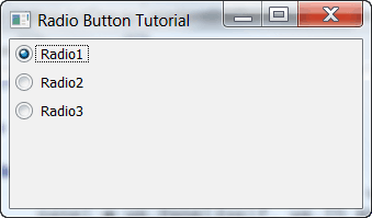
The radio button is a well known widget even to grade schoolers as it is used in many standardized tests. Radio buttons serve to allow the developer to force the user to only select one option from a list of options. They are more visual than a ComboBox, although they basically serve the same purpose. Here’s a simple example:
import wx

class MyForm(wx.Frame):

    def __init__(self):
        wx.Frame.__init__(self, None, wx.ID_ANY, "Radio Button Tutorial")
        panel = wx.Panel(self, wx.ID_ANY)

        radio1 = wx.RadioButton( panel, -1, " Radio1 ", style = wx.RB_GROUP )
        radio2 = wx.RadioButton( panel, -1, " Radio2 " )
        radio3 = wx.RadioButton( panel, -1, " Radio3 " )

        radio1.Bind(wx.EVT_RADIOBUTTON, self.onButton)
        radio2.Bind(wx.EVT_RADIOBUTTON, self.onButton)
        radio3.Bind(wx.EVT_RADIOBUTTON, self.onButton)

        sizer = wx.BoxSizer(wx.VERTICAL)
        sizer.Add(radio1, 0, wx.ALL, 5)
        sizer.Add(radio2, 0, wx.ALL, 5)
        sizer.Add(radio3, 0, wx.ALL, 5)
        panel.SetSizer(sizer)

    #----------------------------------------------------------------------
    def onButton(self, event):
        """
        This method is fired when its corresponding button is pressed
        """
        btn = event.GetEventObject()
        label = btn.GetLabel()
        message = "You just selected %s" % label
        dlg = wx.MessageDialog(None, message, 'Message',
                               wx.OK|wx.ICON_EXCLAMATION)
        dlg.ShowModal()
        dlg.Destroy()

# Run the program
if __name__ == "__main__":
    app = wx.App(False)
    frame = MyForm()
    frame.Show()
    app.MainLoop()
Note that the main difference between this button and the ones that we saw in the previous article is the style flag: RB_GROUP. This causes all the following radio buttons to be a part of one group. If you set that flag again, then you’ll start a new group from that point on (see also the Zetcode tutorial). We have also bound each of the buttons to one event handler that will display a MessageDialog to the user that tells them which button they chose. Contrived? You bet! But it’s good for illustrative purposes.
Let’s Take a Spin with wx.SpinButton
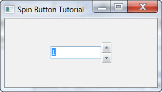
The SpinButton is actually just the up-down arrows to the right of the text control that you see in the screenshot above. Most of the time, the SpinCtrl or the FloatSpin widget would probably be better. But here’s an example anyway:
import wx

class MyForm(wx.Frame):

    def __init__(self):
        wx.Frame.__init__(self, None, wx.ID_ANY, "Spin Button Tutorial")
        panel = wx.Panel(self, wx.ID_ANY)

        self.text = wx.TextCtrl(panel, value="1")
        self.spin = wx.SpinButton(panel, style=wx.SP_VERTICAL)
        self.spin.SetRange(1, 100)
        self.spin.SetValue(1)

        self.Bind(wx.EVT_SPIN, self.OnSpin, self.spin)

        vSizer = wx.BoxSizer(wx.VERTICAL)
        sizer = wx.BoxSizer(wx.HORIZONTAL)
        sizer.Add(self.text, 0, wx.CENTER)
        sizer.Add(self.spin, 0, wx.CENTER)
        vSizer.Add(sizer, 1, wx.CENTER)
        panel.SetSizer(vSizer)

    def OnSpin(self, event):
        self.text.SetValue(str(event.GetPosition()))

# Run the program
if __name__ == "__main__":
    app = wx.App(False)
    frame = MyForm()
    frame.Show()
    app.MainLoop()
The code above is taken almost verbatim from the wxPython Demo. Note that you can set the orientation of the buttons. In this case, we set it to be vertically oriented. You can also set it to be horizontal. There are other styles too, but there doesn’t appear to be much documentation so I was unable to find out which were for the SpinButton and which were for the SplitterWindow. Oh well. Back to the code above. As you can see, rather than binding to EVT_BUTTON as we have in the past, we instead bind to EVT_SPIN. For some reason the wxPython demo uses event.GetPosition to get the spinner’s position. You could just call “self.spin.GetValue” and get the same thing.
Get Refreshed with AquaButton
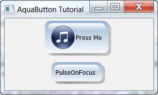
The next three buttons all come from the Advanced Generic Widgets (AGW) library that is included with wxPython and was created by Andrea Gavana. We will start off by looking at his AquaButton. The AquaButton is one of the simplest widgets in the AGW library. Let’s take a look at how we create a couple of them:
# aquaBtnDemo.py

import wx
import wx.lib.agw.aquabutton as AB

########################################################################
class MyForm(wx.Frame):

    #----------------------------------------------------------------------
    def __init__(self):
        wx.Frame.__init__(self, None, wx.ID_ANY, "AquaButton Tutorial")
        panel = wx.Panel(self, wx.ID_ANY)

        bmp = wx.Bitmap("agt_mp3.png", wx.BITMAP_TYPE_ANY)
        button = AB.AquaButton(panel, bitmap=bmp, label="Press Me")
        button.SetForegroundColour("black")
        button.Bind(wx.EVT_BUTTON, self.onButton)

        buttonTwo = AB.AquaButton(panel, label="PulseOnFocus")
        buttonTwo.SetForegroundColour("black")
        buttonTwo.SetPulseOnFocus(True)

        sizer = wx.BoxSizer(wx.VERTICAL)
        sizer.Add(button, 0, wx.CENTER|wx.ALL, 5)
        sizer.Add(buttonTwo, 0, wx.CENTER|wx.ALL, 5)
        panel.SetSizer(sizer)

    #----------------------------------------------------------------------
    def onButton(self, event):
        """
        This method is fired when its corresponding button is pressed
        """
        message = "You pressed the button!"
        dlg = wx.MessageDialog(None, message, 'Message',
                               wx.OK|wx.ICON_EXCLAMATION)
        dlg.ShowModal()
        dlg.Destroy()

# Run the program
if __name__ == "__main__":
    app = wx.App(False)
    frame = MyForm()
    frame.Show()
    app.MainLoop()
The AquaButton supports bitmaps, so in this example we show two buttons: one with a bitmap and one without. Another neat feature of the AquaButton is its ability to pulse when it has the focus. You can turn this feature on or off. The second button has this feature turned on. The reason that the ForegroundColour is set is because on Windows 7, the panel is a bright white in color and that makes it difficult to read the text on the button if you use the default font color. You can also set the AquaButton’s background color and its hover color.
The GradientButton
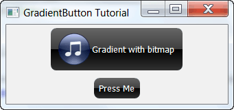
The GradientButton is similar to the AquaButton in that they both have rounded corners and can have an optional bitmap on them. The GradientButton does not support pulsing though. However, as its name implies, the GradientButton allows you to set its gradient from the top to the bottom as well as its top/bottom colors when pressed. We’ll just take a quick look at how to instantiate one since all the color setting is pretty self-explanatory and there are good examples of that in the wxPython demo:
# gradientBtnDemo.py

import wx
import wx.lib.agw.gradientbutton as GB

########################################################################
class MyForm(wx.Frame):

    #----------------------------------------------------------------------
    def __init__(self):
        wx.Frame.__init__(self, None, wx.ID_ANY, "GradientButton Tutorial")
        panel = wx.Panel(self, wx.ID_ANY)

        bmp = wx.Bitmap("agt_mp3.png", wx.BITMAP_TYPE_ANY)
        gbBtn = GB.GradientButton(panel, bitmap=bmp,
                                  label="Gradient with bitmap")
        gbBtnNoBmp = GB.GradientButton(panel, label="Press Me")
        gbBtnNoBmp.Bind(wx.EVT_BUTTON, self.onPressMe)

        sizer = wx.BoxSizer(wx.VERTICAL)
        sizer.Add(gbBtn, 0, wx.CENTER|wx.ALL, 5)
        sizer.Add(gbBtnNoBmp, 0, wx.CENTER|wx.ALL, 5)
        panel.SetSizer(sizer)

    #----------------------------------------------------------------------
    def onPressMe(self, event):
        """"""
        message = "Thank You!"
        dlg = wx.MessageDialog(None, message, 'Message',
                               wx.OK|wx.ICON_EXCLAMATION)
        dlg.ShowModal()
        dlg.Destroy()

# Run the program
if __name__ == "__main__":
    app = wx.App(False)
    frame = MyForm()
    frame.Show()
    app.MainLoop()
As you can see, creating a GradientButton is quite simple and straightforward. Feel free to give it a try! I’ll wait…done already? Then let’s finish up with the ShapedButton!
Get Into Shape with the ShapedButton
The ShapedButton is probably the most complex button that we’ll look at in this article. By complex, I mean, full-featured. You can create a normal button, a bitmap button, a weird offset bitmap+text button, toggle buttons and you can rotate the text at any angle. If you look at the wxPython demo, you’ll also see how to make the button into an elliptical shape. The ShapedButton requires the Python Imaging Library to be installed, so if you don’t have it, get it now! When you’re ready, we’ll look at the code used to create the screenshot above:
# shapedBtnDemo.py

import wx
from wx.lib.agw.shapedbutton import SButton, SBitmapButton
from wx.lib.agw.shapedbutton import SBitmapToggleButton, SBitmapTextToggleButton

########################################################################
class MyForm(wx.Frame):

    #----------------------------------------------------------------------
    def __init__(self):
        wx.Frame.__init__(self, None, wx.ID_ANY, "ShapedButton Tutorial")
        panel = wx.Panel(self, wx.ID_ANY)

        bmp = wx.Bitmap("agt_mp3.png", wx.BITMAP_TYPE_ANY)
        size = (75,75)

        sBtn = SButton(panel, label="Press Me", size=size)
        sBtn.Bind(wx.EVT_BUTTON, self.onShapedBtn)

        bmpBtn = SBitmapButton(panel, wx.ID_ANY, bitmap=bmp)
        bmpBtn.Bind(wx.EVT_BUTTON, self.onBmpShapedBtn)

        bmpToggleBtn = SBitmapToggleButton(panel, wx.ID_ANY, bitmap=bmp)
        bmpToggleBtn.Bind(wx.EVT_BUTTON, self.onToggle)

        bmpToggleTxtBtn = SBitmapTextToggleButton(panel, wx.ID_ANY,
                                                  bitmap=bmp,
                                                  label="Toggle!",
                                                  size=(100,100))
        rotatedTxtBtn = SButton(panel, label="Rotated!", size=size)
        rotatedTxtBtn.SetAngleOfRotation(90)

        sizer = wx.BoxSizer(wx.HORIZONTAL)
        sizer.Add(sBtn, 0, wx.ALL, wx.CENTER, 5)
        sizer.Add(bmpBtn, 0, wx.ALL, wx.CENTER, 5)
        sizer.Add(bmpToggleBtn, 0, wx.ALL, wx.CENTER, 5)
        sizer.Add(bmpToggleTxtBtn, 0, wx.ALL, wx.CENTER, 5)
        sizer.Add(rotatedTxtBtn, 0, wx.ALL, wx.CENTER, 5)
        panel.SetSizer(sizer)

    #----------------------------------------------------------------------
    def onBmpShapedBtn(self, event):
        """"""
        dlg = wx.ColourDialog(self)
        dlg.GetColourData().SetChooseFull(True)
        if dlg.ShowModal() == wx.ID_OK:
            print "'You selected: %s\n" % str(data.GetColour().Get())
        dlg.Destroy()

    #----------------------------------------------------------------------
    def onToggle(self, event):
        """"""
        if event.GetIsDown():
            wx.CallAfter(self.showDialog, "You Toggled Me!")
        else:
            wx.CallAfter(self.showDialog, "You untoggled me!")
        event.Skip()

    #----------------------------------------------------------------------
    def onShapedBtn(self, event):
        """"""
        self.showDialog("You Pressed the Normal ShapedButton!")

    #----------------------------------------------------------------------
    def showDialog(self, message):
        """
        Displays a custom message
        """
        dlg = wx.MessageDialog(None, message, 'Message',
                               wx.OK|wx.ICON_EXCLAMATION)
        dlg.ShowModal()
        dlg.Destroy()

# Run the program
if __name__ == "__main__":
    app = wx.App(False)
    frame = MyForm()
    frame.Show()
    app.MainLoop()
In the code above, you can see how to create a normal ShapedButton, a couple toggle buttons and one with some text that’s been rotated 90 degrees. To rotate said text, use the SetAngleOfRotation method and pass in the number of degrees to angle it. Currently there is some kind of bug related to Mouse/Window Capture with the toggle version of the ShapedButton. If you try to display a dialog in your button handler, like in the onToggle method above, you’ll get an error unless you wrap the call in wx.CallAfter. You can read more about the issue on the wxPython mailing list.
Wrapping Up
If you’ve read this far, then you now know something about almost all the button widgets in wxPython. Congratulations! I hope you have found this helpful and that in the future, you don’t take any widget for granted.
Note: The code in this article was tested on the following:
- Windows XP, wxPython 2.8.11.0, Python 2.5
- Windows 7, wxPython 2.8.10.1, Python 2.6


This article comes on and on, successful, without any beautification ingredient, but have the very strong power. Especially make the detailed elaboration at the first view, caused the human to look easily to have the sympathetic chord, I also very approved author’s viewpoint. Approves!